
designing an identity that leads to trust and respect
refreshing a brand’s identity helped amplify their “why” and cement the need for a healthy community


Client:
Tennessee State University’s SNAP Education
TSU SNAP-ED is a health education initiative at Tennessee State University that strives to “improve nutrition and prevent or reduce diet-related chronic disease and obesity among SNAP recipients”. The goal of the SNAP-Ed program is to “improve the likelihood that persons eligible for SNAP will make healthy food choices within a limited budget and choose physically active lifestyles”.
Challenge:
We were tasked with updating the TSU SNAP Education brand identity - refreshing the existing Shop. Cook. Eat identity and identifying a more engaging way to talk about it - to amplify the outcome of the work, to complement the organizational story, and so that the program stood comparably with its peers across the country. The materials produced needed to have the capacity to be used by a variety of internal team members.
Inspiration
After various team meetings and briefings, we were inspired by the stories of the TSU team. They wanted to tell a story that supported the community. Respect was a key theme. They wanted their constituents to feel respected.
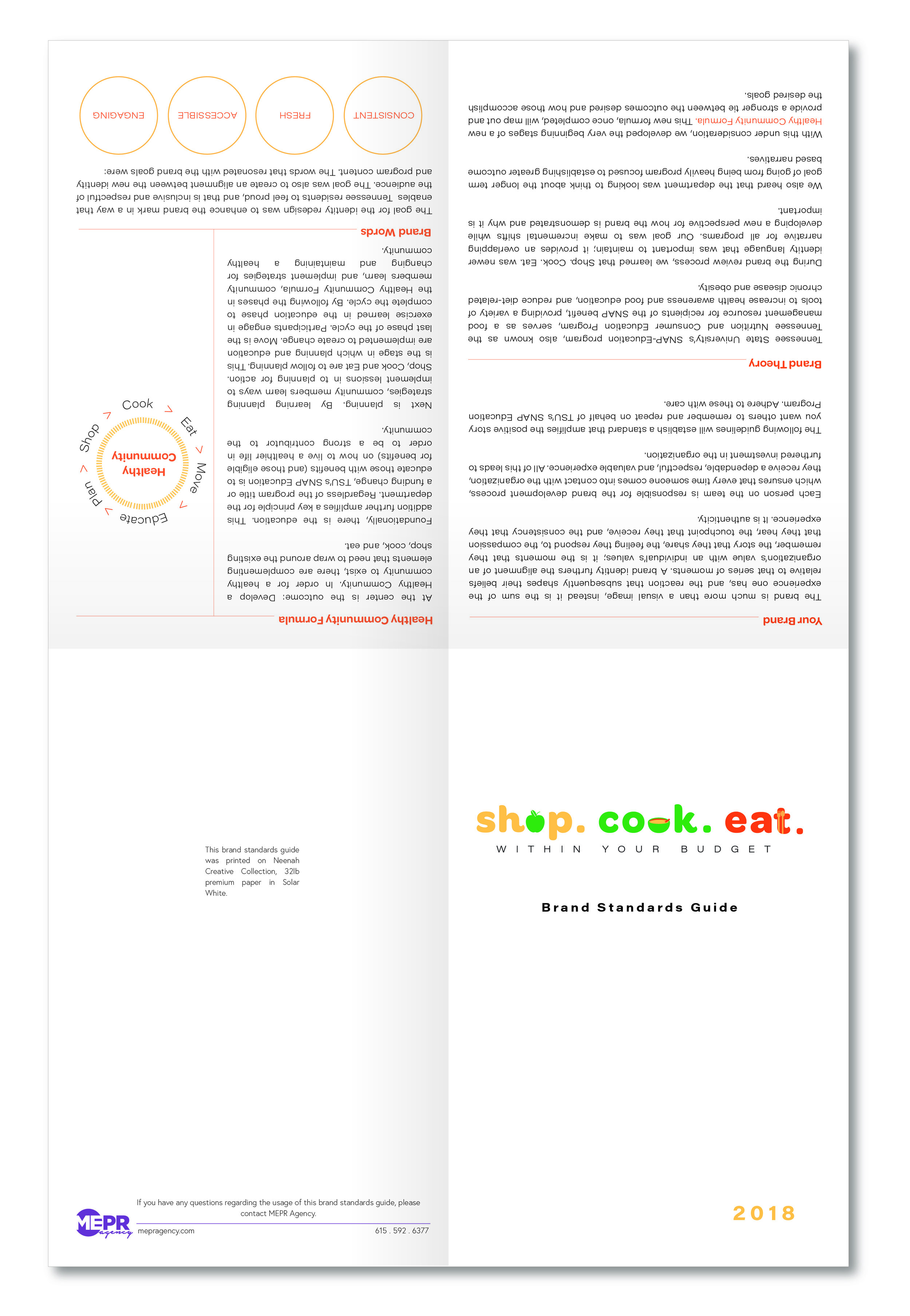
The goal was to create an identity that inspires the SNAP participant to feel respect, positivity and autonomy for their well-being. The branding needed to be consistent so that it maintained its current audience, fresh so it was attractive to younger demographics, accessible for all, and engaging.
Discovery:
During the discovery phase of our project we learned a lot about similar programs across the United States. Several programs carried similar themes throughout the overall design: fresh use of color, easy to navigate content, and great images. The tone of comparable programs was inviting, informative, and suggestive rather than commanding.
We also did an audit of SNAP-Ed’s program material and surveyed staff expectation and sentiment regarding the current state of the program. Overall team members expressed that what set them apart from other programs was their relationships, compassion, and longevity with the community.
Strategy:
Following our discovery, we entered the strategy phase. At the heart of our strategy is the Healthy Community Formula.
For TSU's SNAP Education to be seen as a strong contributor to the health of the community, we needed to develop a stronger message about their position as a community resource (hub) and leader in the conversation of healthy lifestyle choices.
For a healthy community to exist, there are complementing elements that need to wrap around the existing Shop. Cook. Eat.
At the core of the formula is Education. This addition further amplifies a key principle for the department. TSU’s SNAP Education programs’ mission is to educate those with SNAP benefits (and those eligible for benefits) on how to live a healthier life in order to be a strong contributor to the community.
Next is Planning. By learning planning strategies, community members learn ways to implement lessons. Shop, cook, eat are to follow planning. This is the stage in which planning and education are implemented to create change. Move is the last phase of the cycle. During the move phase, participants are encouraged to engage in exercises learned in the education phase to complete the cycle. By following the phases in the Healthy Community Formula, community members learn and implement strategies for changing and maintaining a healthy community.
The strategy for the brand identity refresh and content development centered around the Healthy Community Formula. The Healthy Community Formula is a tool that can help staff produce content for the program. The formula is the beginning of their theory of change.
Implementation:
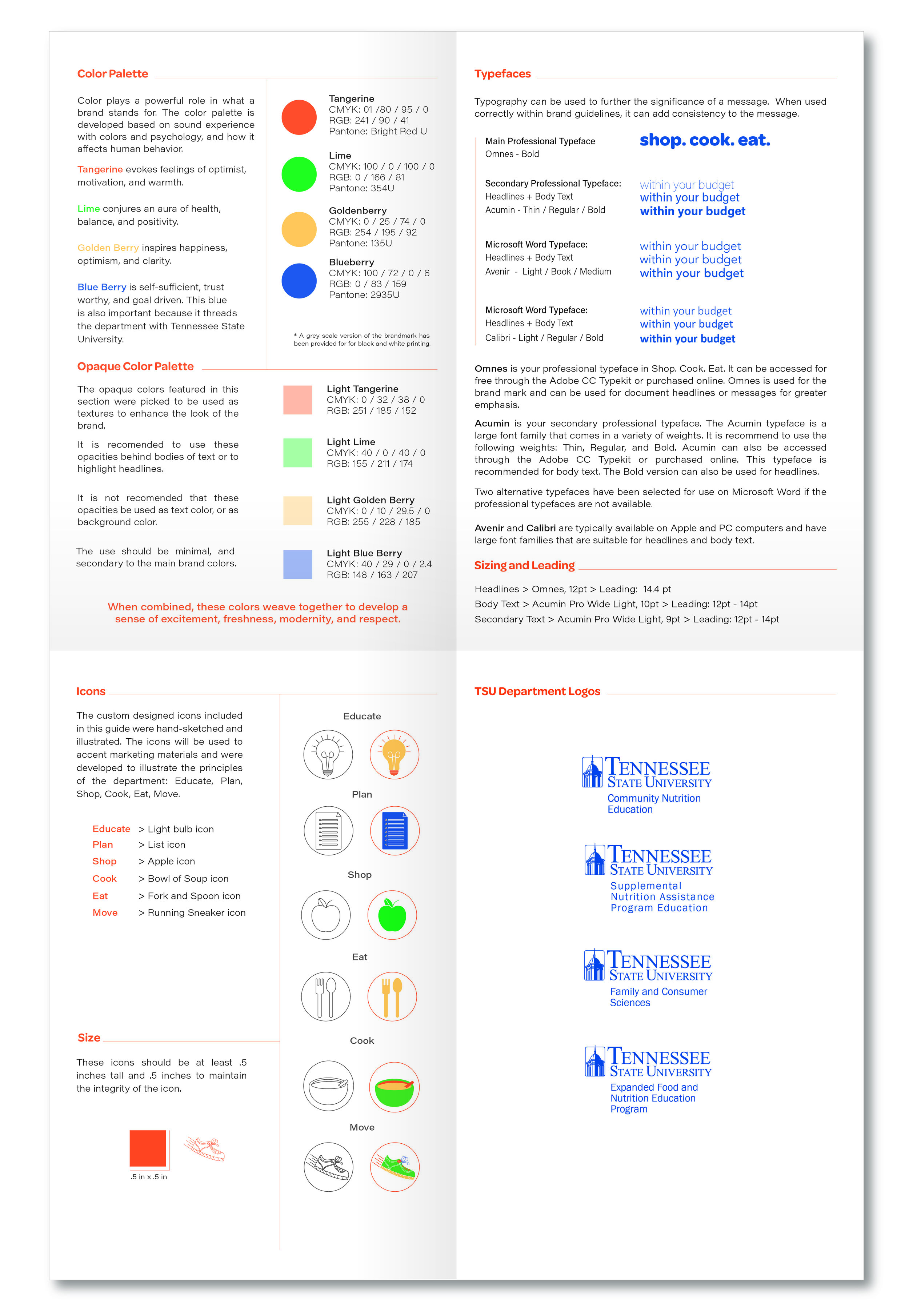
Once the Healthy Community Formula was created, it was implemented throughout the brand refresh. It was implemented on everything from color, typography, icons and marketing collateral.
Icons